|
London Unveils Abominable Logo for 2012 Olympics
The Summer Olympics come to London in 2012, and earlier this week, the organizers unveiled the official logo for those games. Designed by the Wolff Olins firm at a price of Ł400,000, the logo has rapidly united the entire city and, indeed, the entire nation against the logo. In just a matter of hours, thousands had signed online petitions demanding that it be changed. Unofficial website votes at the BBC, the Guardian and elsewhere ran 90% or so against it. Well, it is pretty awful.
According to the good people at Answers.com, there are a few things that go into a successful logo. “An effective logo —
- should be unique, and not subject to confusion with other logos among viewers
- is functional and can be used in many different contexts while retaining its integrity
- should remain effective whether reproduced small or large
- can work in "full-color", but also in two color presentation (black and white), spot color, or halftone
- should be able to maintain its integrity when printed on various fabrics or materials (where the shape of the product may distort the logo)
- displays basic design principles (space, color, form, consistency, and clarity)
- represents the brand/company appropriately.
Well, here it is. Does it succeed?
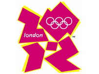
If one looks hard, one can make out that the shapes are supposed to be “2012.” However, if one has to write “London” on a logo for London’s Olympics, it’s rather a failure. The Olympic rings are OK, but maybe the Olympic colors to boot might have been better.
On the BBC “Have Your Say” page, Kevin O'Sullivan of Halstead, United Kingdom, wrote, “I think the 2012 London Olympic Logo is a wonderful representation of how broken and fragmented our Nation has become over the past ten years. This pathetic excuse for a national Olympic emblem comes at a time when our leaders are urging us all to be proud of being British; and yet they couldn’t even find room for a glimpse of the Union flag, or our national colours.”
Meanwhile, someone calling himself Load of Rubbish!, London, wrote, “I think this logo is fantastic....it represents exactly what the Olympics is going to be for London CHAOTIC, EXPENSIVE AND A WASTE OF TIME!! This is what my hike in council tax is paying for ???!!!?? I hope this widespread criticism will eventually make people sit up and take note.... GET RID. Quite frankly, it's embarrassing!” Kevin and “Load” are quite right.
© Copyright 2007 by The Kensington Review, Jeff Myhre, PhD, Editor. No part of this publication may be reproduced without written consent. Produced using Fedora Linux.
Home
|
|
|
